
background
In January of 2017, the first month of my Human-Centered Design and Development class, my class of 30 eager freshmen was assigned our first UX project. My friend Elizabeth and I paired up, and began our two week journey of Project 1 together.
project goal
Our goal was to create or modify the Fitbit to empower users to be healthier. We were to do this by understanding and systematically altering the user's mental model about what activities are beneficial, rewarding these behaviors rather than common "cheats" to the system.
our process
We began by conducting user interviews. Here are some key takeaways from those interviews:
- Fitbit users are annoyed and shamed by the constant and ill timed alerts by their devices.
- Users felt a strong sense of guilt when they received alerts.
- Constant alerts during busy times (i.e. when the user is at work or school) results in users feeling that the Fitbit is an inconvenience rather than a helpful device that encourages them pursue a healthy lifestyle.
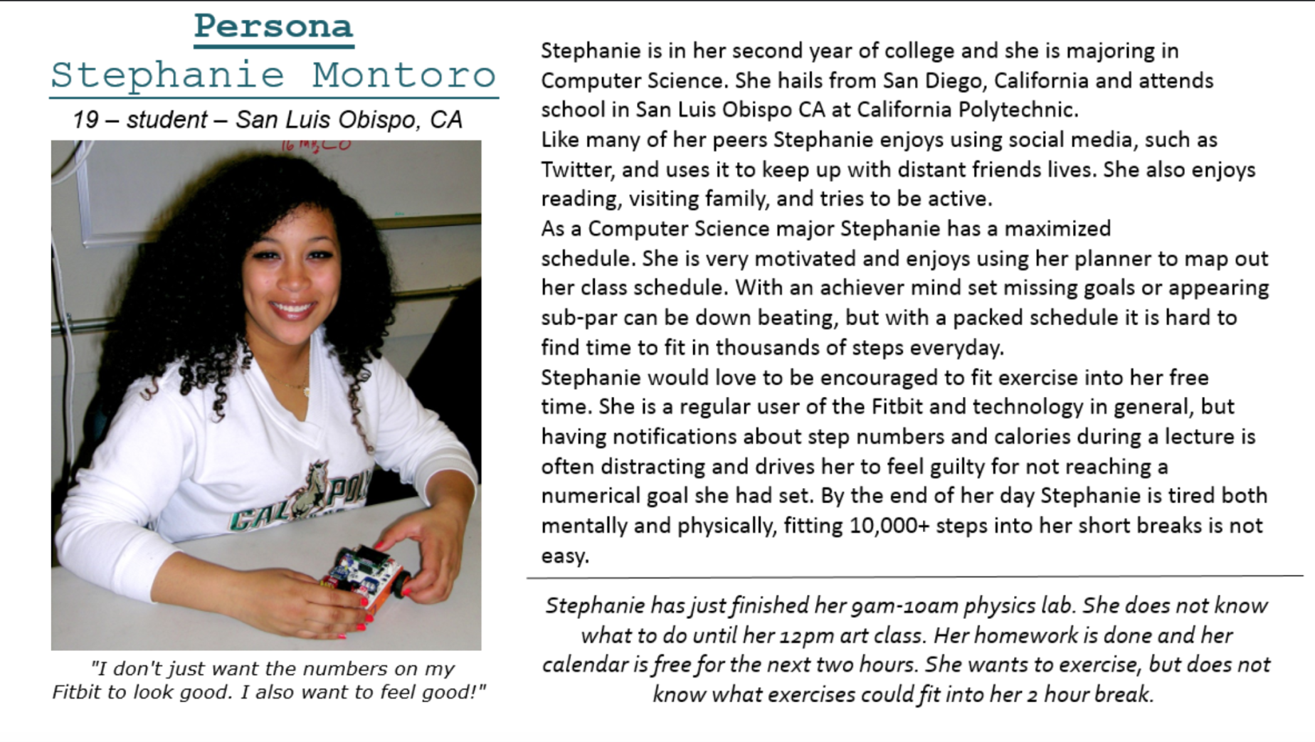
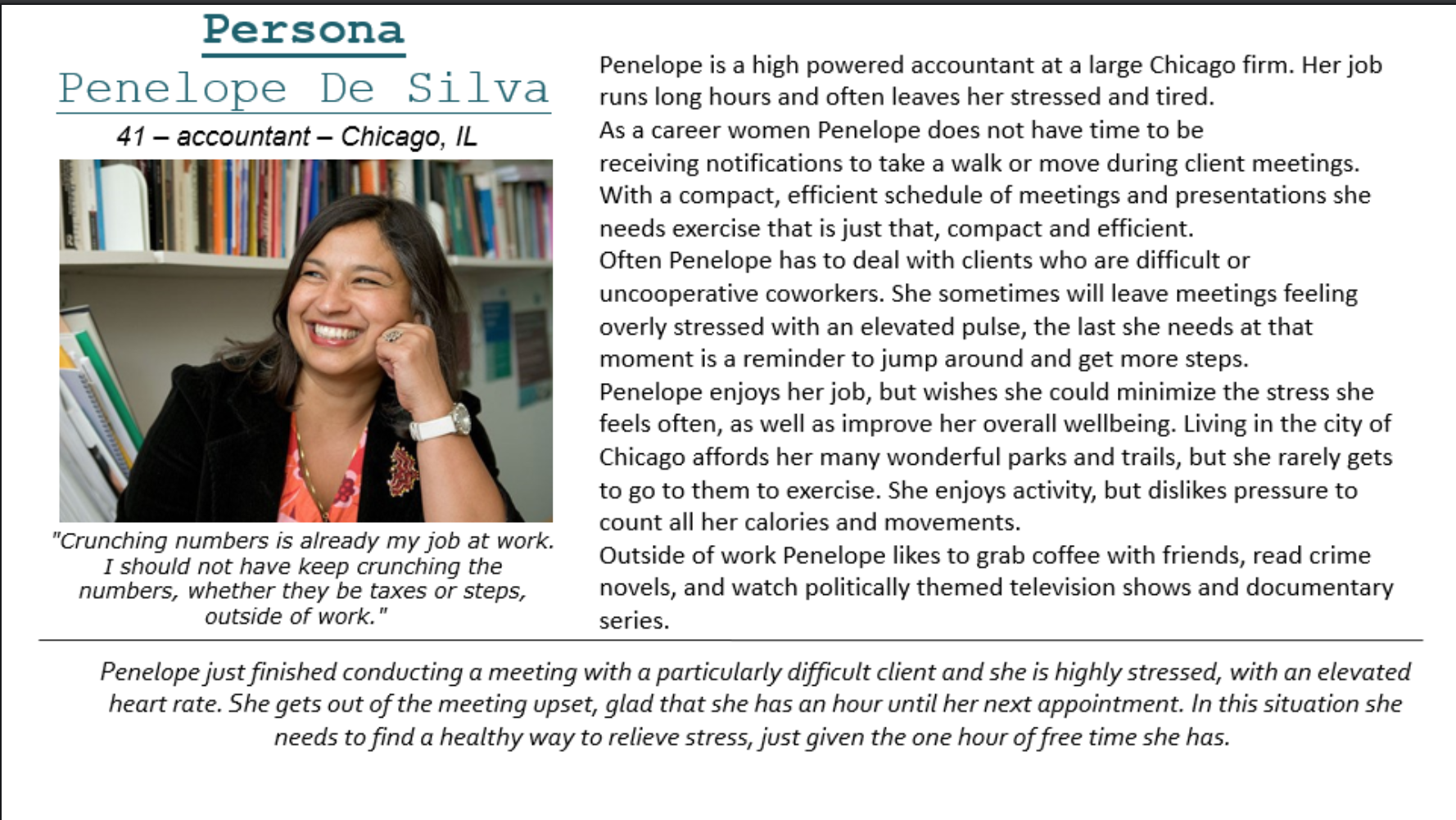
Here are the personas we created after conducting our interviews:
We proceeded to do some some secondary research to find some support for the data we collected in interviews. Here are some important takeaways:
- There are far better ways to exercise than just logging steps [2] (e.g. Running, Swimming, Yoga, etc.)
- The 'dopamine high' associated with social media is a good way to reward a user for working out [4].
- Psychologists think that Fitbits can encourage eating disorders and obsessive behavior towards weight and food, due to pressure to count your every step [5].
Based on our secondary research, we got some new ideas our what our solution should be. We wanted to take the focus off reaching a numerical goal, or risking shame, and onto encouraging people to do meaningful and beneficial exercise in their own time. We decided that incorporating a user's schedule into the Fitbit exercise alert algorithm would reduce user annoyance with the device. The alerts would be scheduled-based and shift the focus from steps to beneficial and timely exercises that keep in mind the user's heart rate.
We branched off this idea and thought about how we could incentivize people to workout without using step counting or calories. We studied other guided workout applications, such as Nike Training Club, and the majority allow users to easily post to social media right after a workout, and they have lower drop out rates than Fitbit. Our secondary research about the dopamine high associated with posting to social media helped us determine that the "likes" and "comments" people receive from their followers serve as motivation and a reminder of the positive nature of exercise.
We followed the habitation process in our idea. We established that the best way for a user to become accustomed to working out is by following the cue, behavior, and reward method. The cue would be the notification that fits in the user's schedule. The behavior would be the user accomplishing the beneficial exercises. The reward would be the "dopamine high" accompanied with sharing to social media.
At this point we began to sketch out our ideas and prepare to receive feedback via user testing.
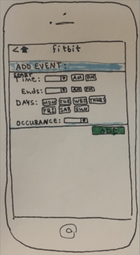
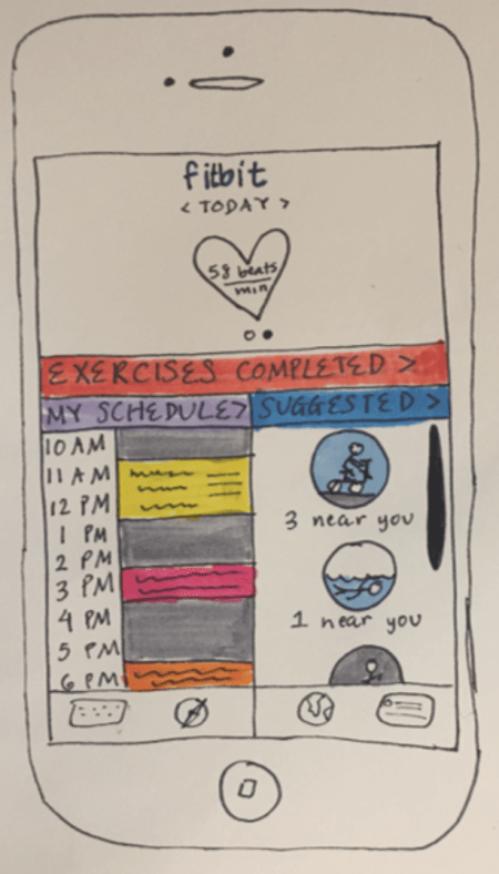
Here are the original sketches we came up with:


Usability Testing
We conducted usability tests on 7 random Purdue students that were within the age range of 18-22. We gave them three scenarios. The following is the protocol we used:
-Scenario 1-
Show the user the home screen. Ask them to think out loud (What they think of the home screen, what they think the application is)
- User should point out that it is a fitness application. Understands that the left portion of the screen is a schedule. User should understand that the right portion of the screen shows suggested workouts nearby. Ask the user to share a run that they just completed onto Facebook
- User should click on 'Exercises Completed' tab.
- User is taken to 'Exercises Completed' screen. User clicks on Facebook icon under the 'Running' tab.
-Scenario 2-
Show user screen with notification asking to input schedule. Tell the user to input their schedule.
- User should click 'Yes' in the notification tab.
- User is taken to the 'Add Event' page. Ask user to input event and click 'Add' when done.
- Show the user to the feedback notification, which asks them if they want to add another event. User keeps doing this until satisfied with events added.
- When user clicks 'No', they are taken to home screen.
-Scenario 3-
Show user notification screen that asks user to slide for workout options. Tell user to that they want to go on a bike ride.
- User should slide the screen. Show the user the 'Suggested Workouts' page.
- User should choose the biking workout.
- Show user the map page. User should say that it is a map of their bike route. The user should say that they would press the play button when they want to start their route. Once they press it, the time begins.
After usability testing, we made some changes to our UI. Here is the rationale based on each scenario.
Scenario 1:
Everyone understood that the application was a fitness application whether they were Fitbit users or not. But, when asked to post their past workout on social media, the users did not click the 'Completed Workouts' tab, instead they clicked on either the dashboard icon on the bottom menu, or the profile icon of the bottom menu, both of which are already part of the existing application. We realized that the intricate detail of our icons in the bottom menu, caused the users to think that they were a part of the usability test. Thus, we decided to blur out the icons in order to avoid any confusion. We also learned that some people did not understand that the "3 near me" text under the icons on the right side meant that there were 3 routes near them. One person thought that this meant that there were three people biking near them. To fix this, we changed the text to say "3 routes".

Scenario 2:
Some users thought that the scheduling aspect of our application was for inputting events such as meetings and classes. Others thought that this was for the user to input their workout schedule, which is not what we wanted. So, we decided to redesign the page that allows the user to input their schedule by making it obvious that it was able to be used to schedule any of kind of event, class or exercise, they planned to do that day. We made this clear by using the phrase "I'm busy from".

Scenario 3:
Everyone that we tested was able to figure out how to get to the 'Suggested Workouts' page successfully. They understood what the page meant, and that it shows routes that are near the user. The users were also able to understand the map page and figured out that if they clicked the green button, that it would start the route.
*Note: Given that this was my class' first project, my professor wanted to emphasize the importance of creating paper prototypes and thus did not allow us to create digital prototypes.
takeaways from this project
I went into this project unsure of my ability to work effectively in a team, and I came out of this project a better team member. I learned that in order to be a great team member, you need to learn how to be a good listener, and how to take feedback. Liz and I agreed on some ideas, and differed on some ideas. But the process of working out those differences made us both better communicators in a team setting.